via dezeen.com
Architectural photographer Roland Halbe has sent us his photographs of a social housing project in Madrid by Spanish office Estudio Entresitio.
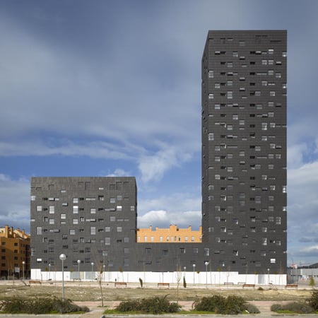
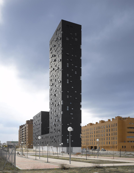
Top and above photographs are by Roland Halbe
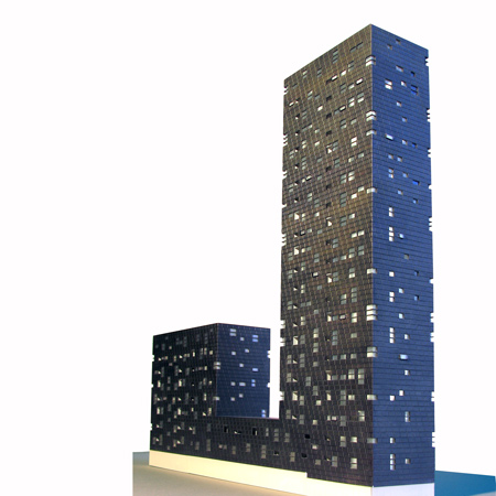
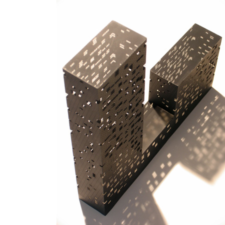
Called 132 Social Housing Block, the 22-storey building has two towers of different heights.
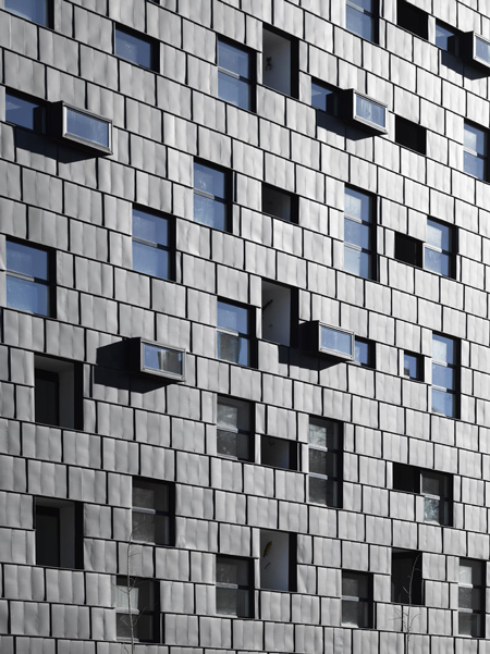
Above photograph is by Roland Halbe
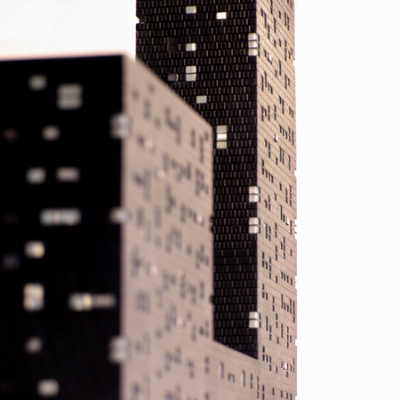
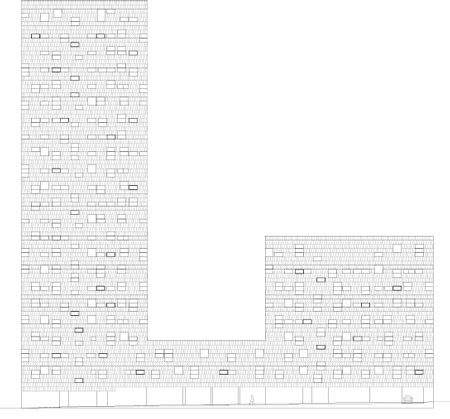
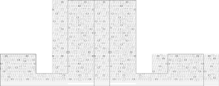
It is clad in zinc tiles and windows are scattered across the surface so that the boundaries of individual dwellings are hidden from the outside.
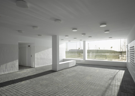
Above photograph is by Roland Halbe
The block contains 132 one- and two-bedroom apartments and includes retail spaces on the ground floor.
The information that follows is from the architects:
132 Social Housing Block
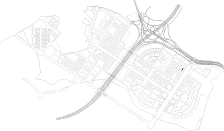
Ensanche de Vallecas, lot 5.16.This project is the result of a competition run by Madrid’s Municipal Housing Agency at the end of 2003. The philosophy of the competition was that each team would offer the best architecture solution that was able to imagine, subject to compliance with the “economic” parameters for the lot; maximum surface to be built and number of dwellings, and always considering that it is a social housing development.
It was the choice of the contestants to decide whether a “measured” solution that would meet the other urban planning conditions of floor occupation, alignments, heights, etc.., or if, as was our case, raised a proposal that needed further planning changes. Our winning proposal was a tower of 22 floors.
The project can be explained in many ways, but there is one to which we do not like to resign, that has to do with the floor plan’s efficiency and the resolution of a given functional program such as housing. We deal with apartments “for rent” that are characterized by their small size, as they are, from sheltered housing, those most in line with the minimum dimensional regulations. The project builds a total of 132 one and two bedrooms housing units, for a net floor area of 9000 sqm plus 300 sqm of ground floor commercial use.
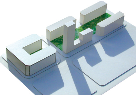
Above ground, the building occupies 70% of the limit set by the alignment of the façades, with a general setback to liberate more public space on the front sidewalk access and natural relief of ground floor commercial use. This setback can avoid the typical chamfers of the area planning and work with sharper volume geometry.
For a certain floor area, reducing the footprint of the building necessarily implies growing in height and in this case we propose a shaped volume with a profile proportions, lets say, uncommon. One might think of the building as an aggregation of a tower and a block by a central body, but we are more interested in the idea of a free development in height, where the balance between the parts and the whole is somewhat disturbing.
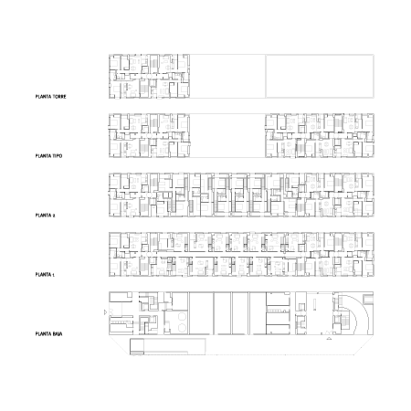
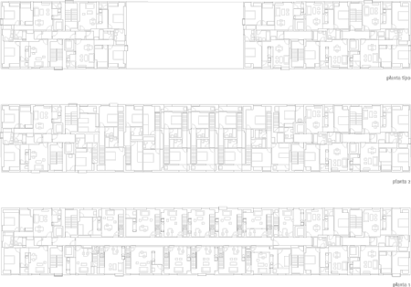
The floor plan solution is based on the geometric process of “double symmetry”, as in the ambigrams, which are words or figures that can be read alike when rotated 180 degrees. This strategy works to blur the different parts as the order of each one is not clear and becomes associated with the order of the others. It also has to do with the fact that the building, as a free block, is perceived as a piece in which there is no distinction between front and rear or beginning and end, and responds similarly to both the access road as to the green zone that runs lengthwise on the other front.
Only in a clinical cut of this mixed development, we would begin to understand how diversity has ordered the program. Although all the apartments have 1 or 2 bedrooms, the smallest elements are set in height, and developed on one floor, while the duplex, as repetition of functionally undifferentiated units, occupy the longitudinal development of the plinth. The homes are not the result of an a priori subdivision of the plant but are solved interlaced both in plan and section. The duplex units are composed of two versatile rooms that cross section to enjoy both North and South directions. By having access by the first floor can respond to both, the characteristic use (planning) of housing or to tertiary application, commercial and offices at the first floor and hosting at any level above ground floor.
As indeed there are many ways of explaining a project, there is another one that deals with the urban character of the building, with the construction of the city and the need to, somehow, characterize new residential tissues, in this case of Madrid, that as many others lack of intention in its definition. In this sense the project works on several levels. The outer shell uses resources of non-differentiation and scale ambiguity. It is a skin of zinc scales set in horizontal bands that slide one over another with a slight offset, and in which voids are inserted with the intention of not making clear the floor levels. We propose a combinatorial system of recognizable types of housing windows which are placed at the best position from the inside of the rooms. On this support structure of unity and also of diversity, are added some projecting crates, that as free forms of distortion, introduce a slight vibration on the elevation.
The relationship between the concepts of “coexistence of scales” and “scaling ambiguity”, what is big and what is small along with what is not revealed either as large or small, establishes the dialogue that occurs in other settings by the historic city and the successive developments that occur in it over the time. Somehow, duality becomes almost a search method, on the one hand we work with the intention that the city does not only speak of its buildings but the void that they generate, there is a well-defined function scheme in plan and no clear translation in the elevations, the condition of continuous wrapping is enhanced that, despite its lightweight material, contributes to the perception of the building as a solid, and we propose for construction of such a sharp and crisp volume, a scaled and not very smooth finish but certainly homogeneous. In this way we mix day-to-day and extraordinary, the regular domestic window that corresponds to a clear functional order with extraordinary placements, removing the composition and helping to understand the whole as a uniform mass.
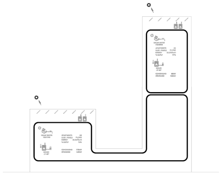
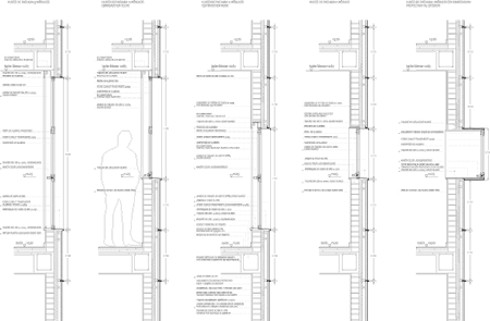
There is also a third way of explaining the project that could be the titled as “architecture and technique”, which deals with the fitting of ideas to make them buildable. In developing the execution project and during the construction process occurs filtering of legislation, planning, budgeting, constructive feasibility and, above all, the real spatial translation of the topics raised. Thus, the zinc facade becomes the central argument not only for its physical implementation, but also as an energy efficiency strategy. We propose a low maintenance solution, ventilated, which facilitates the transpiration of the facade, protects the building from rainwater infiltration and prevents interstitial condensation. It involves the optimization of acoustic and thermal insulation of the building, which being located on the outside of the brick walls, avoids possible thermal bridges.
In the hot season, it produces a “chimney effect”, the sun heats the air standing in the chamber, rising by convection and forcing fresh air to enter on the lower part of the façade, preventing the accumulation of heat in the inter layer space. In winter, however, solar radiation is not sufficient to produce the movements of air and ventilated facade acts as a heat accumulator to produce the opposite effect.
More: Architecture, all, photography
Email this • Subscribe to this feed • Digg This! • Stumble It! • Share on Facebook
Posted on Friday, March 19th, 2010 at 2:36 pm by Rose Etherington. See our copyright policy. Follow comments through the RSS 2.0 feed.
Posted via web from MAYA THOR’s NoteBooK ImageS
![Reblog this post [with Zemanta]](http://img.zemanta.com/reblog_e.png?x-id=7f558edf-dfd3-41e2-a434-f3eb1709e51a)

No comments:
Post a Comment